Tuesday, February 4, 2014

Red Barn in Tennessee


I thought I'd post the demo for Monday's watercolor class online. I began with a quick pencil sketch to establish the composition:


Then I painted the sky with a graduated wash of three mixed blues: Cobalt Blue with a bit of Permanent Rose and Viridian at the top; a lighter wash of Cobalt Blue and Viridian below that; and a still lighter wash of Cobalt Blue, Viridian and Winsor Yellow at the bottom.


Next I added in the mountain in the distance with a mix of Viridian and Cobalt Blue. The roof of the barn was also painted with this mix, and foliage was added behind the barn and tree, with a mix of Winsor Yellow, Viridian and Permanent Rose.


The barn was painted with a mix of Permanent Rose, Winsor Yellow and Viridian, and the grass in front was painted with the same colors, but with more Winsor Yellow and water in the mix.


The trees are painted with Winsor yellow added to a bluish gray mixed from the Permanent Rose and Viridian.


A wash of the same colors is used for the grass in the foreground, scraped with a credit card to create the grassy texture.


Shadows are added into the tree with a mix of Winsor Green, blue shade, Permanent Rose and Winsor Yellow.

Trees in the background are added with mixes of Viridian, Permanent Rose and Winsor Yellow.


Winsor Yellow, Permanent Rose and Winsor Green, blue shade are used to deepen the colors in the foreground grass and create interest in the foreground.


Shadows are added in the barn and the grasses with Permanent Rose and Winsor Green.


More shadows are added under the tree and the edges are softened with a damp Cirrus 1/4" flat brush.

Monday, March 18, 2013

Planning a Painting

One of the biggest reasons paintings fail is that the artist fails to plan. Students are sometimes in a rush to get to the painting part, going for  a quick line drawing of the subject and then filling in the shapes by trying to match each color individually. Instead they should be trying to find color relationships that work and exploring different options to find one that really resonates with them. Below is an example of planning I went through for a painting of my dog Casey (which has yet to be painted, but I've used these studies for watercolors of other dogs): 


If you're wondering about the pencilled-in notes on my sample page, I've used abbreviations for paint colors used in my paint mixes and recorded the colors so that I can recreate them.
  • AY=Aureolin (Yellow)
  • V=Viridian (Green)
  • CR=Cadmium Red
  • CB=Cobalt Blue
  • WG=Winsor Green (blue shade)
  • AC=Alizarin Crimson
  • LR=Light Red
  • IR=Indian Red
  • PR=Permanent Rose
  • UB=French Ultramarine (blue)
I've tested background colors here to see how they work together with Casey's coloring. It's not necessary to paint the whole painting twice, but it really does help to work out the important relationships beforehand!


Tuesday, February 26, 2013

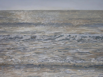
Silver Morning


I promised my pastel class I'd write down some of my favorite mixes, so I thought I'd start with a seascape. This piece was one of five commissioned for a beach house in Seaside.  I wanted to try adding just a bit of color to my grisailles, but I still wanted to keep the overall look fairly neutral. This was done entirely with Rembrandt pastels in Bluish Gray and Raw Umber on a middle value gray Canson paper. Together they give a nice silvery quality that's perfect for early morning light.

Here's a look at the work in progress. I begin with the horizon and use raw umber tints, switching to bluish gray higher in the sky. All that gets blended and then darker bluish gray and raw umber tints are blended for the distant ocean, adding shadows and highlights as I move forward.


I did an oil sketch of this on an earlier post. It had a similar look but used totally different pigments. I really need to do more in these colors-maybe a foggy morning in the mountains or a still life with silver and white objects. Hmm.

Favorite Watercolor Mixes


I like to use Cobalt Blue, Winsor Yellow, Permanent Rose and Viridian as much as possible in the beginning of a painting. These colors are non-staining and easily removed from most papers, which means you can adjust your composition if needed. Mixed together they will only give a middle value, so to get darks it’s best to switch to other paints. I switch French Ultramarine for Cobalt Blue, Winsor Green Blue Shade for Viridian, and Permanent Alizarin for Permanent Rose. For warm, rich darks sometimes I’ll add in Burnt Sienna. 

This portrait in progress of  Pootie, a chow puppy, uses
Winsor Yellow, Permanent Rose and Cobalt Blue for the
fur, with Viridian and Permanent Rose for the
nose followed by Winsor Green Blue shade and
Permanent Alizarin crimson for the darkest darks.

  
Apart from not getting darker than a middle value, these colors  are really versatile.  The portrait of "Pootie" uses Winsor Yellow, Permanent Rose and Cobalt Blue for the fur. I find it's helpful to mix a red violet first from Permanent Rose and Cobalt Blue, then add varying amounts of the Winsor Yellow to get a range of yellow golds and browns. 

The green golds around her muzzle use the same mix but start with a blue violet and add yellow for a raw umber color.

Her nose and gums are painted with a mix of Viridian and Permanent Rose. To get the really dark darks in her nostrils and pupils I've mixed Winsor Green blue shade and Permanent Alizarin Crimson. Both mixes will go from a blue green gray to a blue gray to a neutral gray and then a rosy gray as the magenta is added to the green. The Permanent Rose and Viridian mix is easily scrubbed out if I need to adjust the shape of her nose or mouth, but it doesn't get dark enough on its own. I find the Winsor Green and Permanent Alizarin Crimson mix on its own results in too harsh a look, and it tends to bleed when rewet.

The background is Viridian and Permanent Rose with a touch of Winsor Yellow. Again, it's easily scrubbed out if I need to. It's good to keep your options open as long as possible so you can make changes as the painting develops. 


Tuesday, June 5, 2012

Testing your limits


Silver Morning
6" X 6"

I've been spending a lot of time researching limited palettes lately, and coming up with some of my own. Often painters adopt a palette from someone whose work they admire. I've done that in the past but always wound up using only a few paints on the palette. Lately I've weeded out the paints that haven't worked. I also limit my palette to single pigment paints, which really simplifies matters.

 This study uses a limited palette of viridian, permanent rose, winsor yellow and white. I love that the blue grays are all made from a green.  This shows the extent to which a color is influenced by the color that surrounds it!